Outlook Calendar Analytics: Analyze and Visualize How You Spend Your Time
Outlook Calendar analytics turns a schedule into evidence. When your events are named consistently, you can see where your hours actually go, compare activities over time, and spot an imbalance before it becomes a problem.
This guide explains a simple way to analyze Outlook Calendar data with Kotomil. It is useful for anyone who already uses Outlook Calendar to plan work, study, meetings, exercise, or personal projects.
Why analyze your Outlook Calendar?
A calendar is usually used to answer, “What is next?” Analytics adds a different question: “What did I actually spend my time on?”
Reviewing a week or month of events can help you:
Compare planned focus time with meetings and admin work
Check whether you are making time for study, exercise, or personal projects
Find activities that take more time than expected
See whether a habit is becoming more consistent over time
Step 1: Make events easy to group
Analytics is only as useful as the event names in your calendar. You do not need a perfect system; start with short, repeatable names for the activities you want to review.
For example:
Deep work for focused project time
Meeting for calls and recurring team sessions
Study for learning blocks
Exercise for workouts
Admin for email, planning, and routine tasks
Use one name for one kind of activity wherever possible. For instance, choose either “Exercise” or “Workout” rather than switching between both. This keeps the totals meaningful when you analyze the data later.
Step 2: Connect Outlook Calendar and review your data
Kotomil works with Outlook Calendar events to visualize your schedule. After connecting your calendar, choose the period you want to review, such as the last seven days or the previous month, then look at the activities that matter to you.
Start with a small question instead of trying to measure everything at once:
How many hours did I spend in meetings this month?
Did I study more consistently than last month?
Which days did I protect for deep work?
Has exercise become less frequent recently?
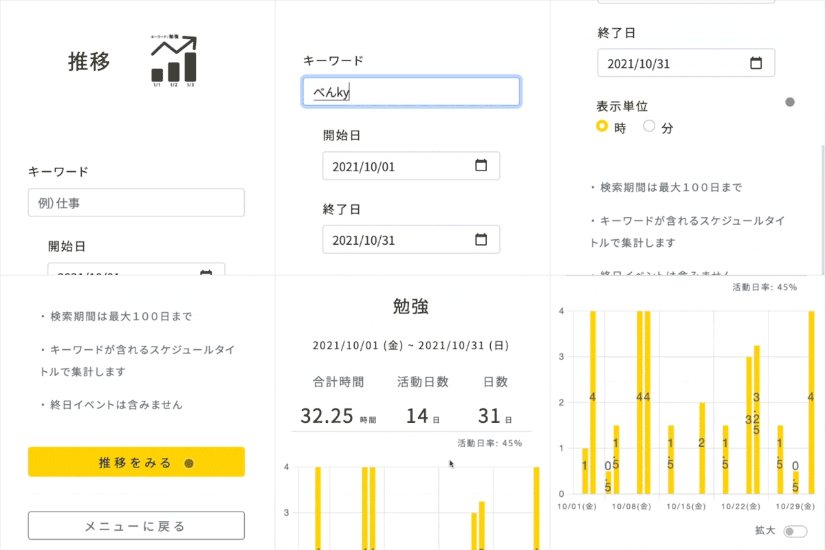
Step 3: Use trend graphs to check consistency
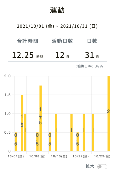
Trend graphs are useful when the question is about change: whether an activity is increasing, decreasing, or becoming inconsistent.
For example, a graph for Exercise can reveal that you worked out regularly at the beginning of the month but stopped during a busy period. The same approach works for study time, client work, reading, lessons, or any activity recorded in Outlook Calendar.
Do not treat one low week as failure. Use the graph to identify the cause—an unusually busy project, travel, or too many meetings—and adjust the next week’s schedule.
Step 4: Check your time distribution for a period
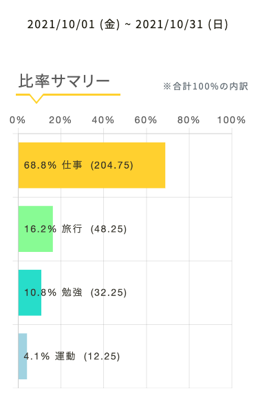
A distribution view answers a different question: where did the whole period go? Select a period such as a calendar month and compare the share of time assigned to each activity.
This makes trade-offs visible. You may discover that meetings occupied more of the month than deep work, or that the study time you intended to protect was repeatedly replaced by other commitments. The goal is not to optimize every hour; it is to make an informed choice about the next period.
A 10-minute monthly Outlook Calendar review
Choose a completed week or month.
Look at the trend for one priority activity.
Review the overall time distribution.
Write down one surprise and one change to try next.
Add that change to Outlook Calendar before the next week begins.
For example: “Meetings took more time than expected, so I will reserve two 90-minute deep-work blocks on Tuesday and Thursday.” A small, specific action is easier to keep than a vague plan to “manage time better.”
Frequently asked questions
Do I need to enter every activity in Outlook Calendar?
No. Begin with the activities you want to improve or protect. Consistently recording three to five categories is often more useful than creating an overly detailed system you will not maintain.
What should I do if my event names are inconsistent?
Pick one preferred name for each category going forward. You can still review older data, but consistency from this point makes future comparisons clearer.
Can I use this for work and personal time?
Yes. Many useful reviews compare work, meetings, learning, exercise, and personal projects. Choose categories that support the decisions you want to make.
Turn your Outlook Calendar into useful feedback
Outlook Calendar analytics works best as a regular feedback loop: record meaningful events, review a period, notice a pattern, and make one scheduling change. With Kotomil, your existing Outlook Calendar can become a clear view of how you spend your time—not just a list of what is coming next.
See where your time goes from your calendar at a glance📊🔍
With Kotomil, just connect Google Calendar to see how much time you spend on each area in charts and lists. It also helps you find what is making you busy and where your time is becoming unbalanced.